HOME TOUR: My Eclectic, Mid-Century Modern House
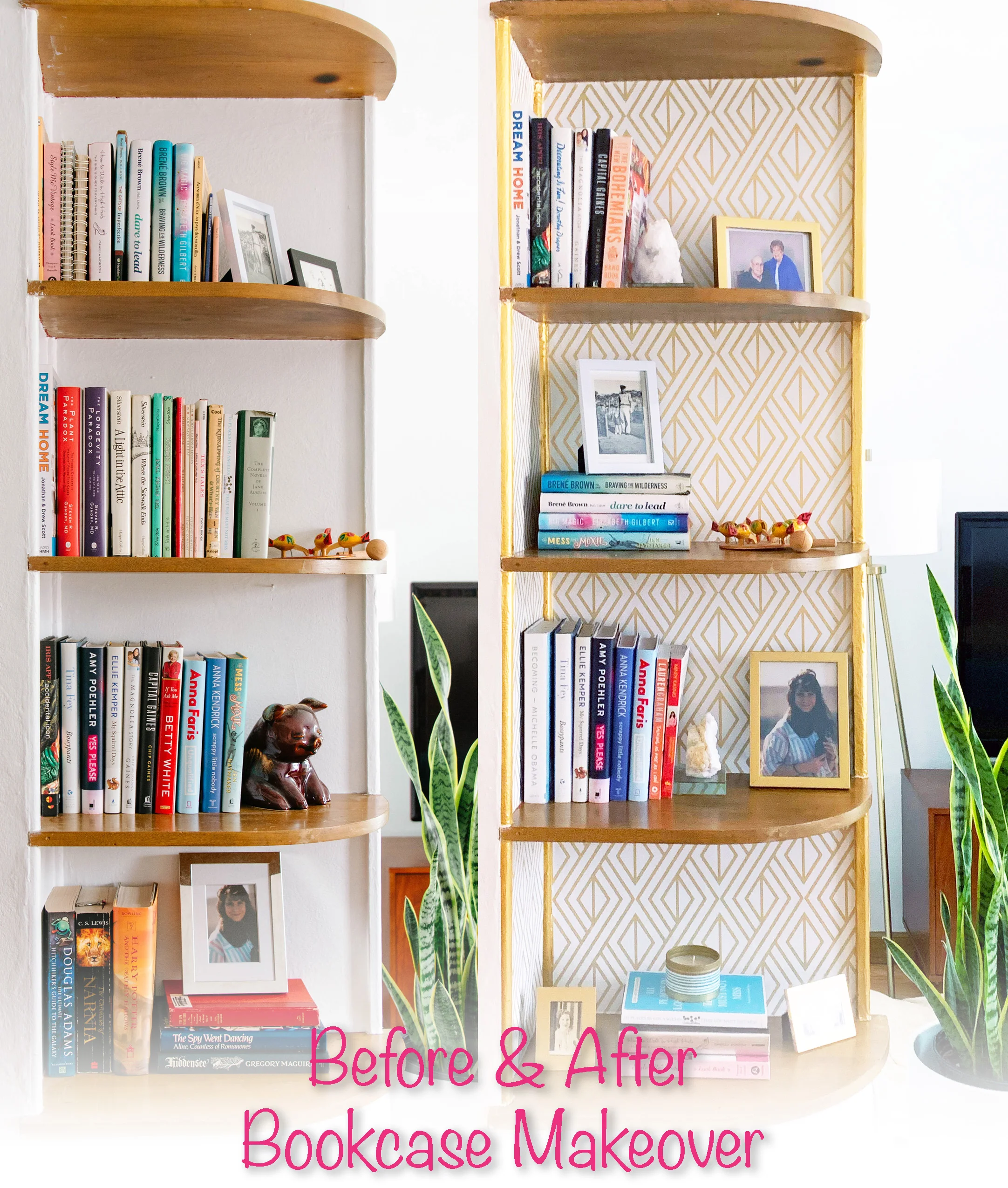
In 2019 my husband and I moved into the historic neighborhood of Aksarben in Omaha, NE. We purchased a triplex with the intent of living in one of the units and renting out the other two. The home has darling post-war architecture with rounded doorways and built-in bookshelves. I have long been a fan of all things vintage, retro and mid-century modern, so upon first seeing this empty shell I not only fell in love immediately but could see all kinds of potential to come!
Photo: Skip DeBusk
To say our new home is small is more than generous. With one bedroom and one bath we downsized from our previous 3-bedroom ranch with full basement to about 680SF. The space is laid out magnificently and although it is tiny is much more efficient. In order to maximize the space I knew I would need to be intentional with the design and furniture layout.
Photo: Mandy McGregor @m.mcgdesigns
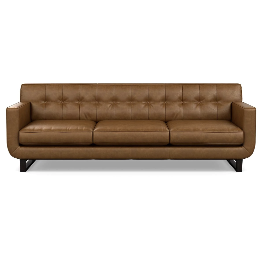
I leaned into the existing style of the home and chose furniture that is predominantly mid-century modern in style. With crisp white walls to lighten up the living room and make it seem bigger, I wanted to add lots of color in the furniture and accessories. I saw this floral chair at Anthropologie and decided to use it as my design inspiration for the living area. I paired velvet curtains and a colorful area rug with a warm buttery leather couch. I travel a fair amount with my day job and wanted to include my souvenirs in the décor. You’ll notice my Russian nesting dolls and Turkish lamp next to the window. A prayer rug from my middle eastern trips (You can read more HERE!) made a gorgeous wall hanging and focal point.
Photo: Mandy McGregor @m.mcgdesigns
Photo: Mandy McGregor @m.mcgdesigns
SHOP THIS LIVING ROOM
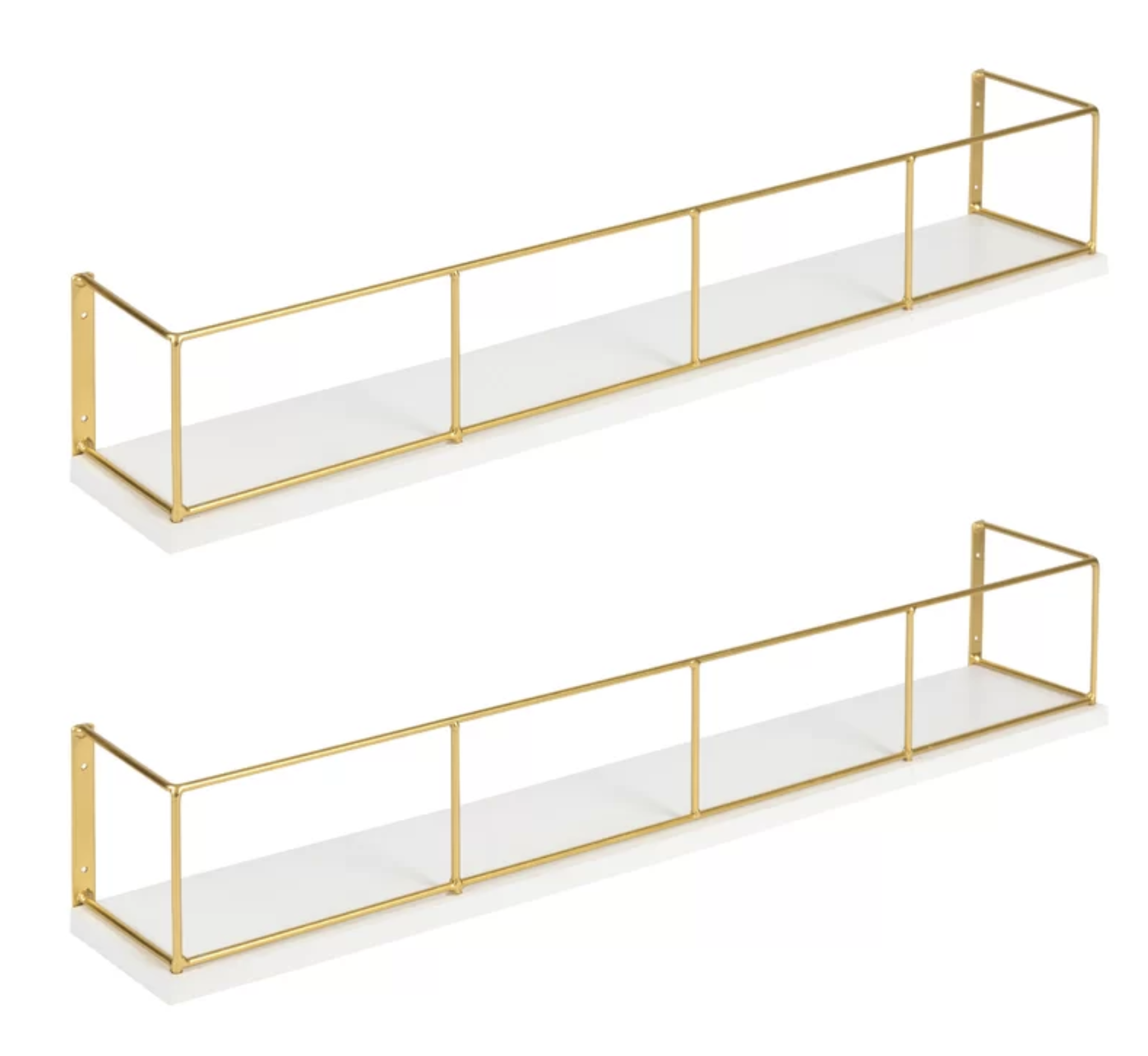
The living area opens right into the dining area and needed to flow seamlessly with the living room décor. I kept the same color scheme and added a mid-century modern table with pink and blue chairs (a great thrift store find!). Mexican pottery and postcards from previous travels are displayed on the wall above the table with a family coo-coo clock heirloom. I added a thrift store bar cart that I spray painted silver with gold wall-mounted shelves for wine glasses to save space and add character to the blank walls.
Photo: Mandy McGregor @m.mcgdesigns
Photo: Mandy McGregor @m.mcgdesigns
SHOP THIS DINING AREA
The kitchen is small but has great light and paired with the white cabinets make the space seem bigger and brighter than it is. There are lots of great nooks and crannies throughout the house for decorations and accessories, including a small shelf over the sink. It was the perfect place for a picture of my grandma and a citrus candle for when I inevitably burn dinner. I chose sunny yellow curtains that I hemmed to allow in more light and added accessories that mimicked the blue, green and pink accent colors used throughout the home.
Photo: Mandy McGregor @m.mcgdesigns
Photo: Mandy McGregor @m.mcgdesigns
Photo: Mandy McGregor @m.mcgdesigns
SHOP THIS KITCHEN
As you make your way under the curved archway into the hallway there is the perfect spot for my vintage telephone table. I found this unique piece and painted it yellow with new reupholstered fabric to match the rest of my home. (You can read more about it HERE!) Above it I placed one of my favorite New Yorker magazine covers I got a few years back when I was working there. The black contrasts perfectly with the yellow. There is an old notch in the wall where a landline telephone used to sit and is now a great accent area for a picture frame and candles.
Photo: Mandy McGregor @m.mcgdesigns
The first door off the hallway is the bathroom. It receives the best light of all the rooms in our house! Painted a neutral light grey I again chose to accessorize with color. Adding color this way means I can easily change out my style and décor should I want to later down the road. I found this fun shower curtain and used lots of green art and towels to match it. I replicated the leaf design on the shower curtain turning it into prints for the walls in the bathroom. This glorious Orchid ties it all together and makes it seem that much more posh. Here’s hoping I can keep the poor plant alive!
Photo: Mandy McGregor @m.mcgdesigns
Photo: Mandy McGregor @m.mcgdesigns
SHOP THIS BATHROOM
The last room in the home is the bedroom, and one of my favorites. Not because it’s where I get to sleep, but because it has the BEST nook. Between the his and her closets-which I am not sure I can now ever live without, is the perfect space for a vanity. I have always wanted a vintage vanity and when I saw this space I knew it was meant to be. I cleaned up my vanity, another of my many great thrift store finds, and after new knobs, some replacement glass shelves and a wood cleaner it was sparkling like new. (You can read more about my vanity makeover HERE!) It fits like it was always meant to be here! Paired with an art deco wall paper behind makes the space pop that much more. I found a velvety bedspread and pink and blue area rug to make all the colors in the room sing. The fringed pink throw blanket adds another level of texture. The globe table lamp and mid-century modern end table are repeats from the living room, adding a level of cohesiveness throughout the two rooms. Top it all off with some gold and yellow accents and you’ve got my dream master suite!
Photo: Mandy McGregor @m.mcgdesigns
Photo: Mandy McGregor @m.mcgdesigns
SHOP THIS BEDROOM
So there you have it-our new home. An eclectic array of souvenirs, mid-century modern furniture and thrift store finds. I can’t wait to walk through the door each day!
Photo: Mandy McGregor @m.mcgdesigns


